
HW7 Solution#
Here’s a .do file you may use
Key Points:
Code that replicates the images is correct
But its a little nuanced:
If your machine runs anything before Stata 18, the format will be correct
So you have to look for the conditional
if c(version)statamentLess reason to be vigilant if you’re running Stata 18
Replicating the image but without the “Classic” Stata look is ok
But some points have to be dropped based on the Rubric
The core idea of this class is that Stata code should anticipate variation in operating systems (
c(os)), filepaths (/vs.\), Stata versions (c(version)), and so much moreA script that runs on one computer may not successfully run on another
Scripts that embrace such ambiguity must be awareded credit as per the rubric
Conditional statements that creatively invoke system or user-defined macros are the best evidence
e.g.
if _rc !=0 {
global repo https://github.com/jhustata/basic/raw/main/

//This allows you to recreate the exact figures and color schemes
//You'll lose 1pt overall if you're color schemes are the default from Stata 18
if c(version)>17 { //tip 4 hw3
    set scheme s2color
}
else { //stcolor is default in v18
    di "you're good to go!"
}
(late assignments will not be accepted for graduating students)
Write a .do file which performs the tasks described below. Your .do file should be called
hw7.lastname.firstname.do. Do not submit your log files as part of the assignment.
Codebook#
Variable |
Description |
Values |
|---|---|---|
tx.dta |
||
|
Center ID |
Integer |
|
Date of transplant |
Date |
|
Recipient has history of previous kidney transplant? |
Binary (1=Yes/0=No) |
|
Recipient’s age |
Integer |
|
Recipient’s BMI |
Numeric |
Question 1#
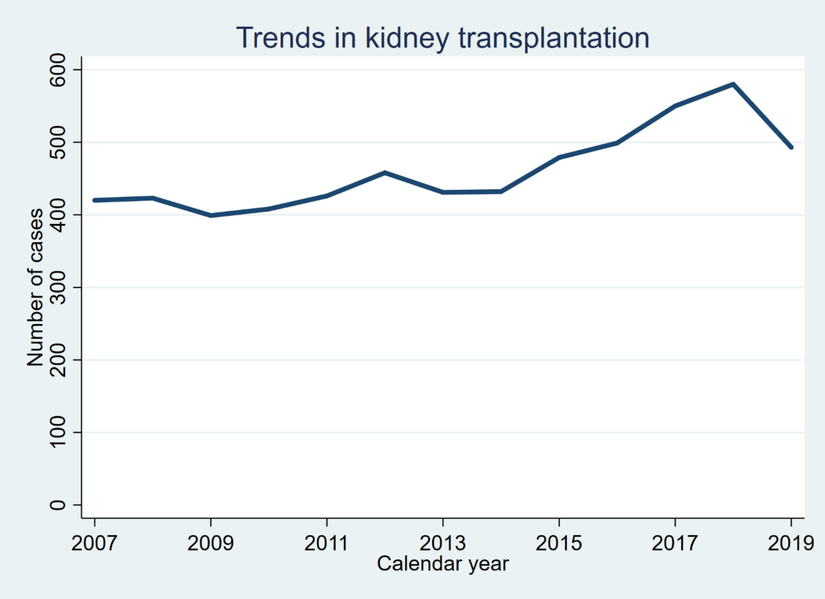
Clear the memory and load tx.dta. Drop all observations with missing values on transplant_date. Reproduce the following graph as precisely as possible.
This graph shows a line plot of the number of cases performed in each calendar year. Be mindful about the thickness of the line, the main title, and the axis labels and titles.
use ${repo}tx, clear
gen year = year(transplant_date)
Save the graph as q1_[yourname].png
Question 2#
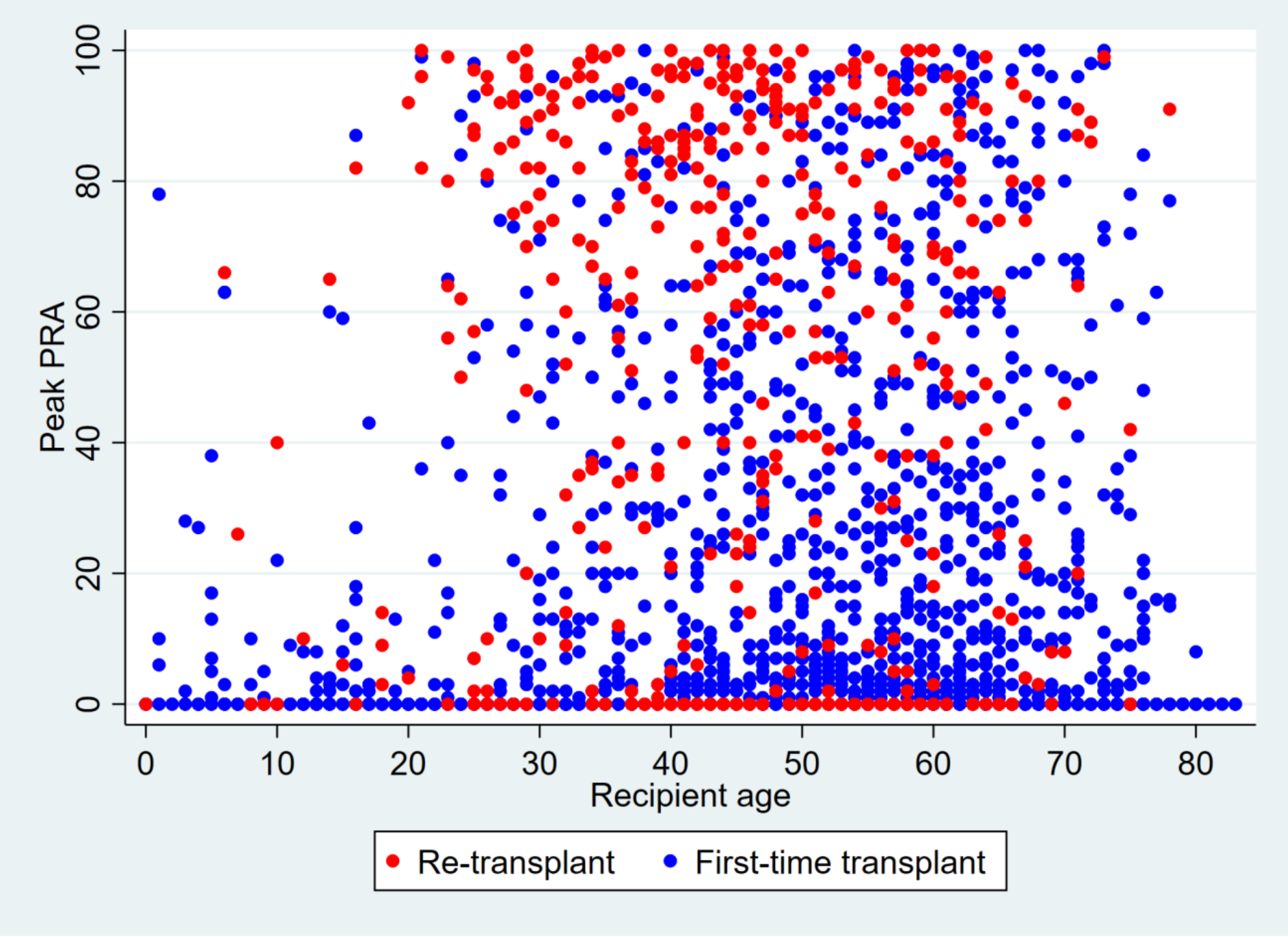
Clear the memory and load tx.dta. Drop all observations with missing values on peak_pra. Reproduce the following graph as precisely as possible.
This graph shows a scatter plot of peak_pra and age, stratified by prev_ki. Observations with
prev_ki == 1 are shown in red. Be mindful about the color (“blue” and “red” in Stata color codes) and
size of the markers, the axis titles, and the legend.
Save the graph as q2 _[yourname].png
Question 3#
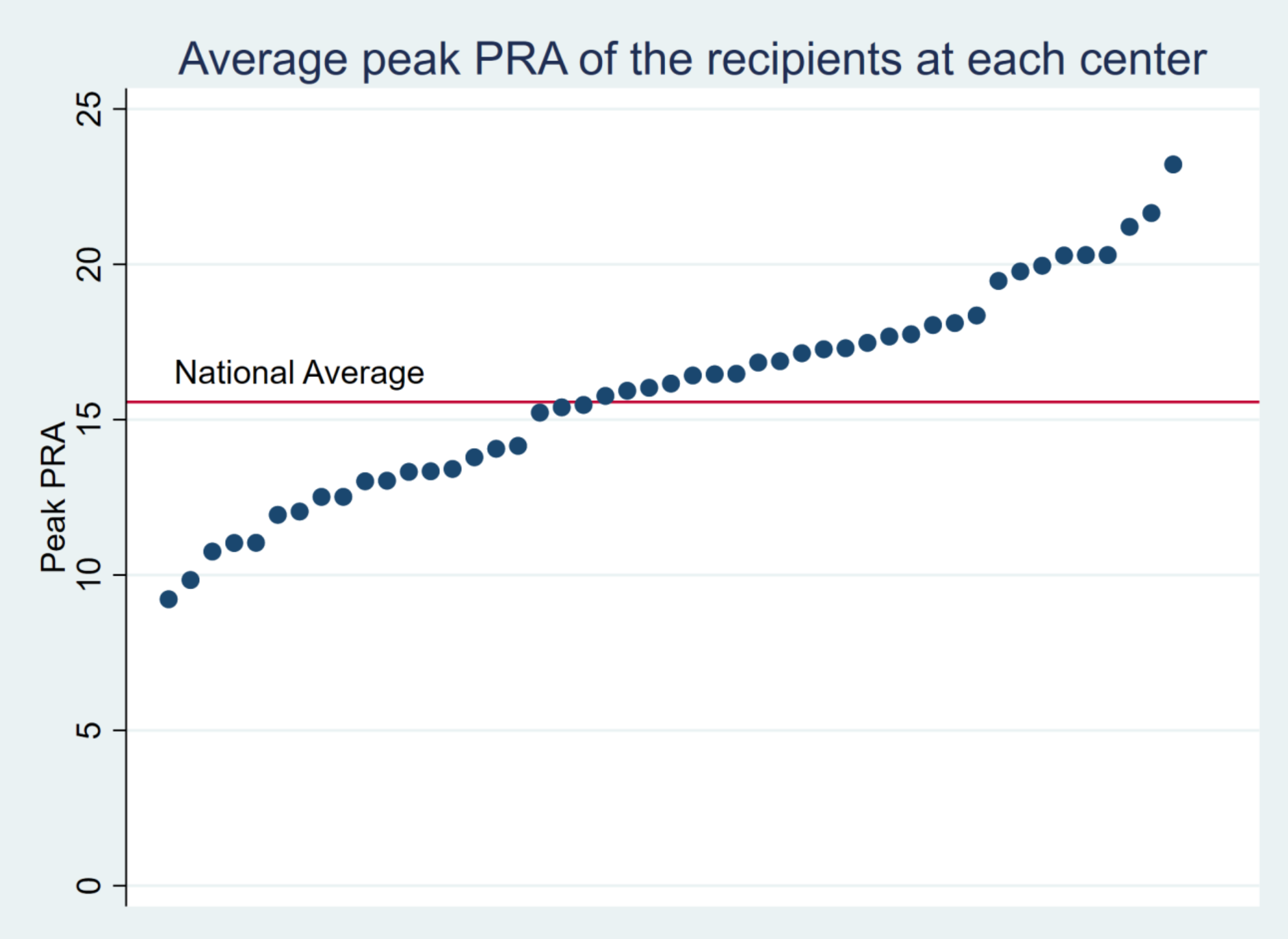
Clear the memory and load tx.dta. Drop all observations with missing values for peak_pra. Reproduce the following graph as precisely as possible.
Calculate the average of peak_pra at each transplant center (ctr_id). Display the average value of
peak_pra after sorting. The location of the text label “National Average” can be hardcoded (i.e.
manually specify the location; about x=7 and y=17). Other markers and lines should NOT be hardcoded
and should be derived by your script using the dataset.
Save the graph as q3 _[yourname].png
Additional Credit (Maximum \(+5\))#
Use the Extra credit challenge DropBox#
Write a program called sampmean to plot random data drawn from a normal distribution. sampmean takes a list of numbers representing different sample sizes. It also takes (optionally) a mean and standard deviation for the normal distribution. If we run
sampmean, at(5 20 100 1000) mean(20)
We get a graph like this:
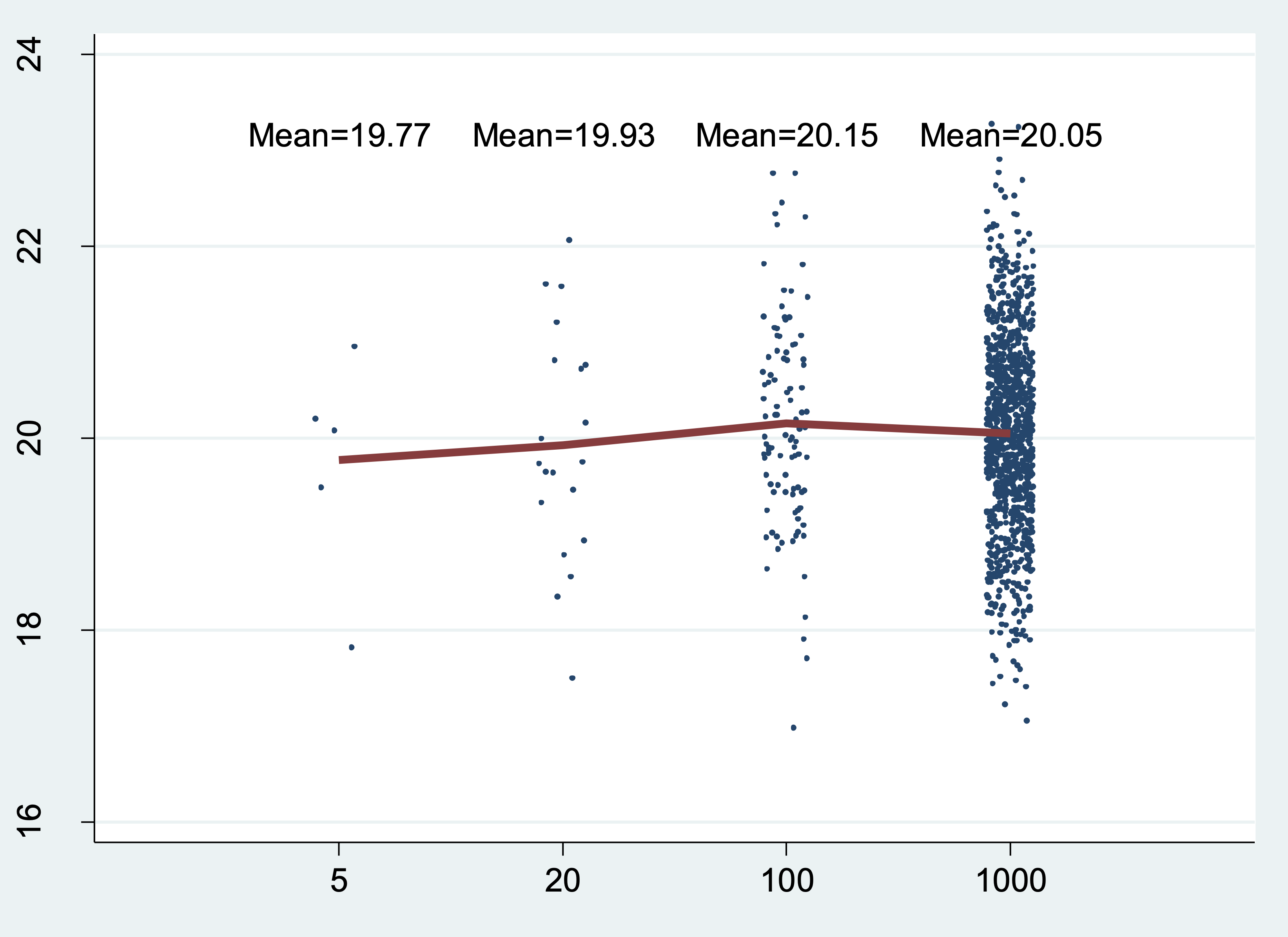
In this example, the program generates four sets of normally distributed random numbers (one set of 5 numbers, one set of 20, one set of 100, and one set of 1000) and calculates the mean for each set. It also plots each randomly generated number (as points) and the group mean (as a red line). The group mean also appears above each group as text.
Here are some more examples. The exact output will depend on the random number seed you use.
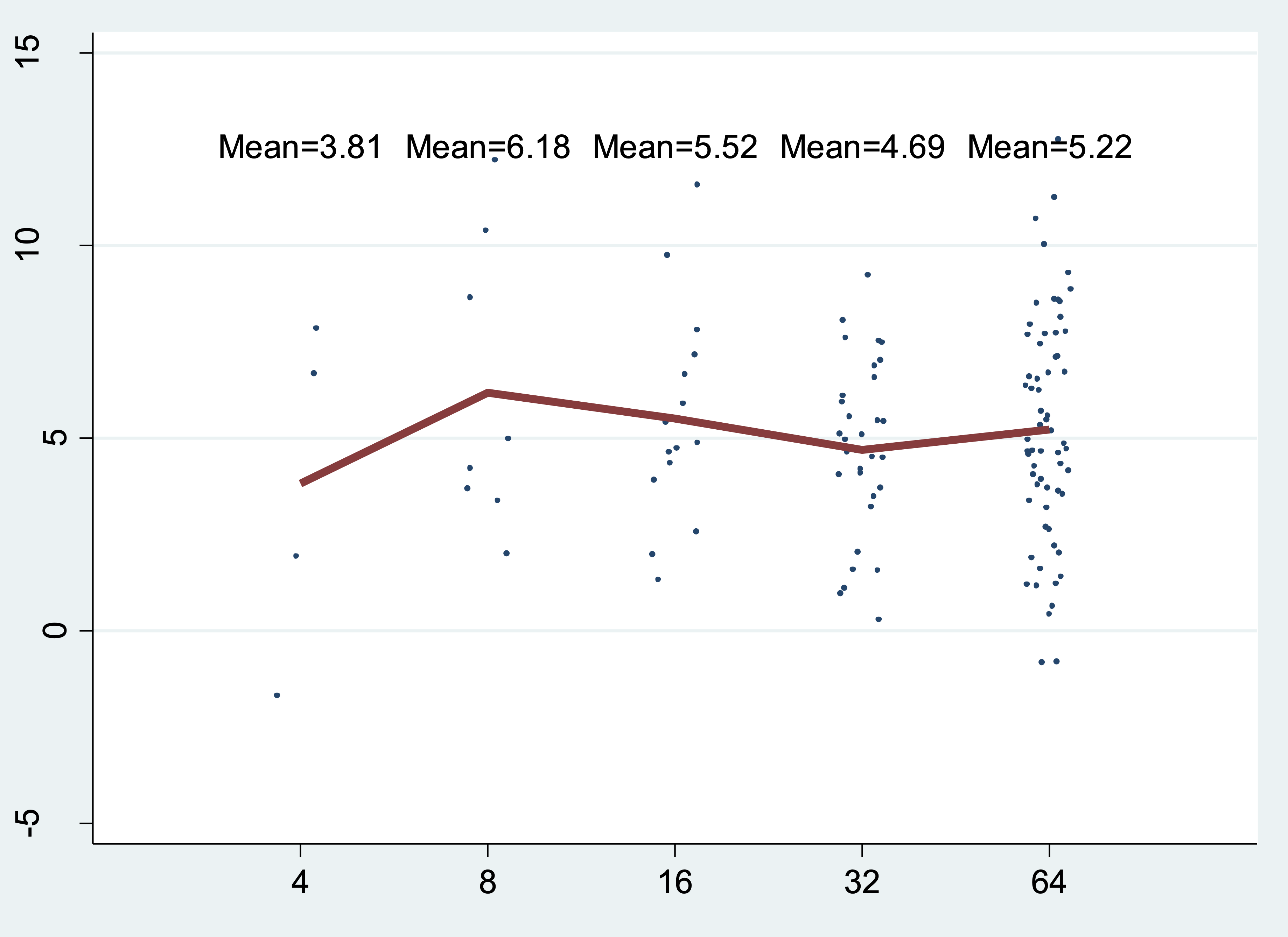
sampmean, at (4 8 16 32 64) mean(5) sd(3)
sampmean, at(100 200 300) mean(5) sd(2) uniform
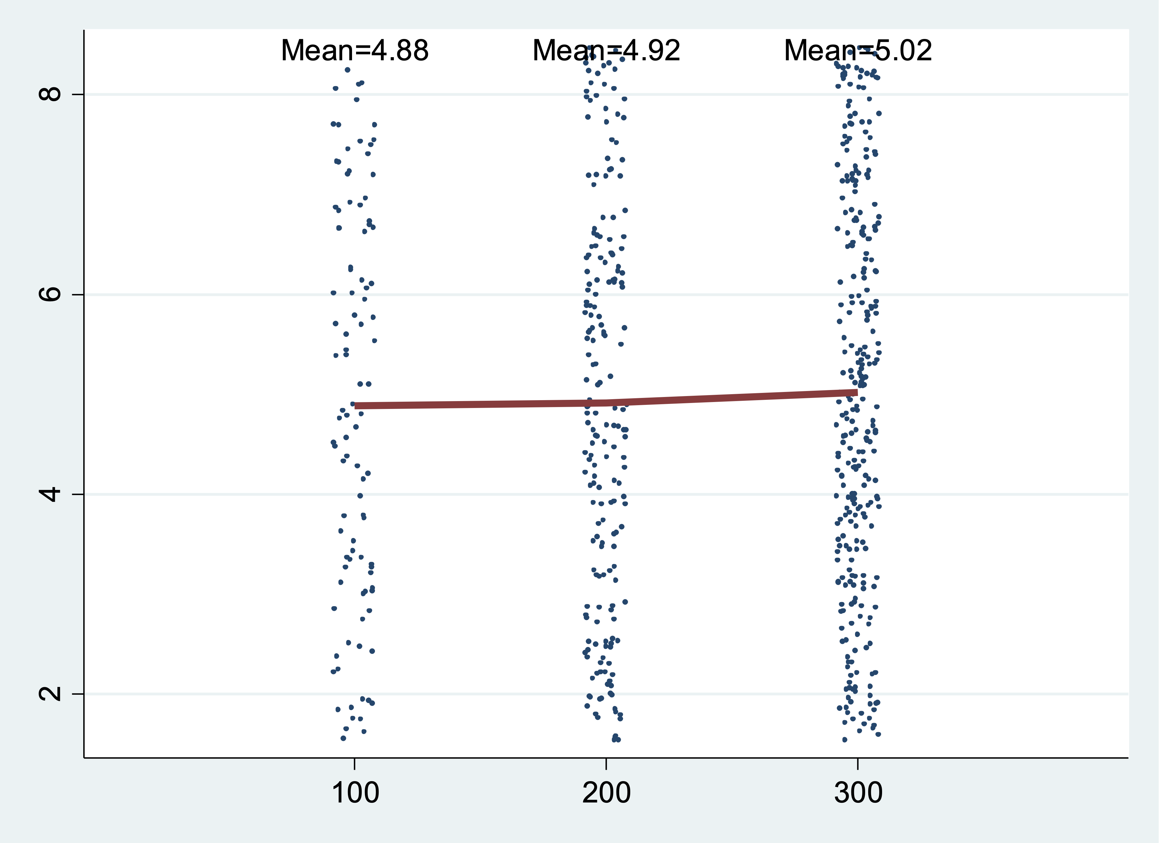
In the last example, the distribution is a uniform distribution instead of a normal distribution.
Hints:
You can use the keyword
numlist(for a list of numbers) just as you do with avarlist(list of variables)The uniform distribution from 0 to 1 has mean 0.5 and standard deviation sqrt(1/12).
Note: this problem is pretty hard! We expect that few people will solve the whole thing, but we will give partial credit for a partial (working) solution. If your program only works partly, then explain in the comments, like this: