Lab 5#
Part 1#
Write a .do file which imports the requested data sets and creates the graphs described below using the slides we have discussed in class. Your .do file (lab5_lastname.do) must create a log file (lab5_lastname.log). This file will contain your answers for both part 1 and part 2 of today’s lab. Your .do file should follow conventions for .do file structure described in class. Do not submit your log files as part of the assignment.
Look at lastname_q1.png through q5.png
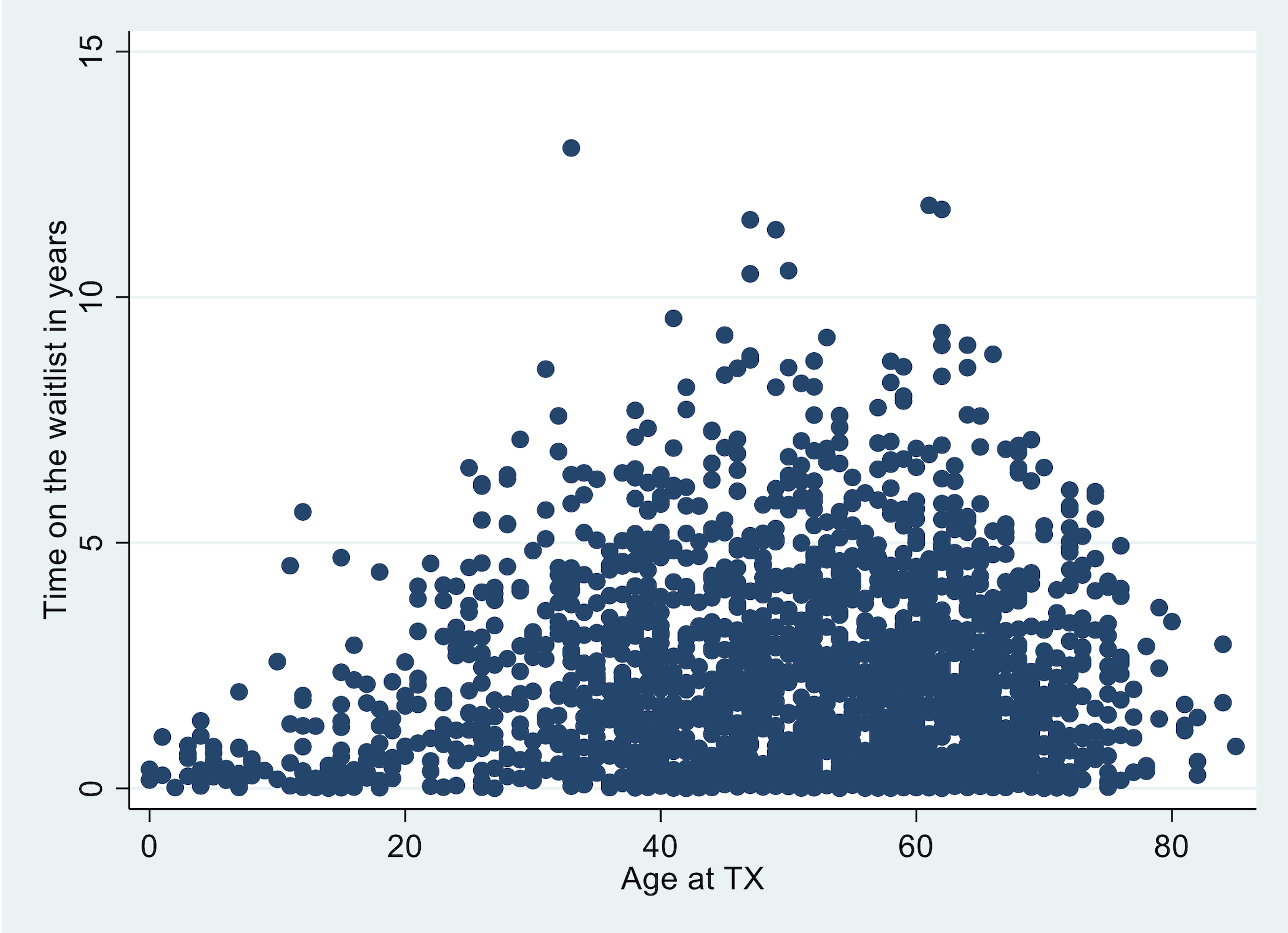
Import transplants.dta. Create a variable label for the variable
wait_yrs, such as “Time on the waitlist in years.” Then, create a scatter plot withwait_yrson the y-axis and age at transplant (age) on the x-axis.
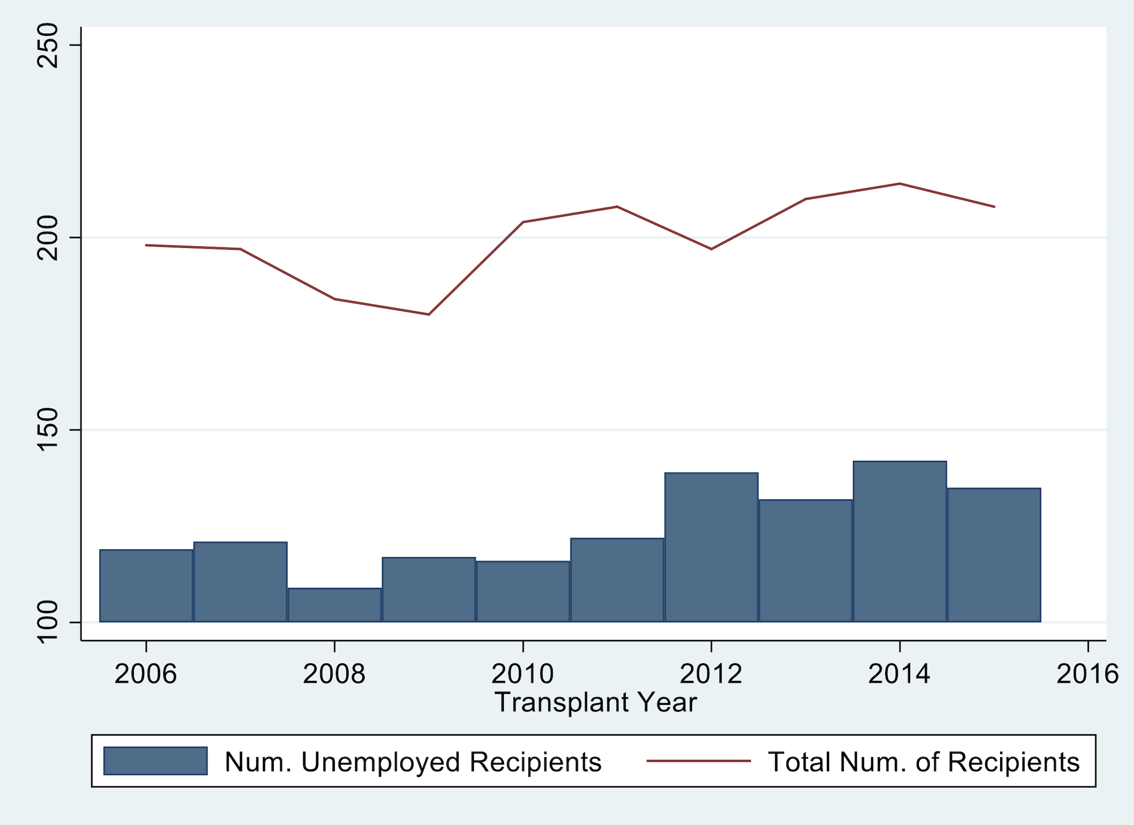
Import tx_yr.dta (created by lecture5.do). In this task you will create one graph that is two plots overlaid on one another. The graph should illustrate (1) the number of recipients who were unemployed (variable: not_working) per year (yr) as a bar graph and (2) the total number of transplants (variable: total) per year (yr) as a line graph.
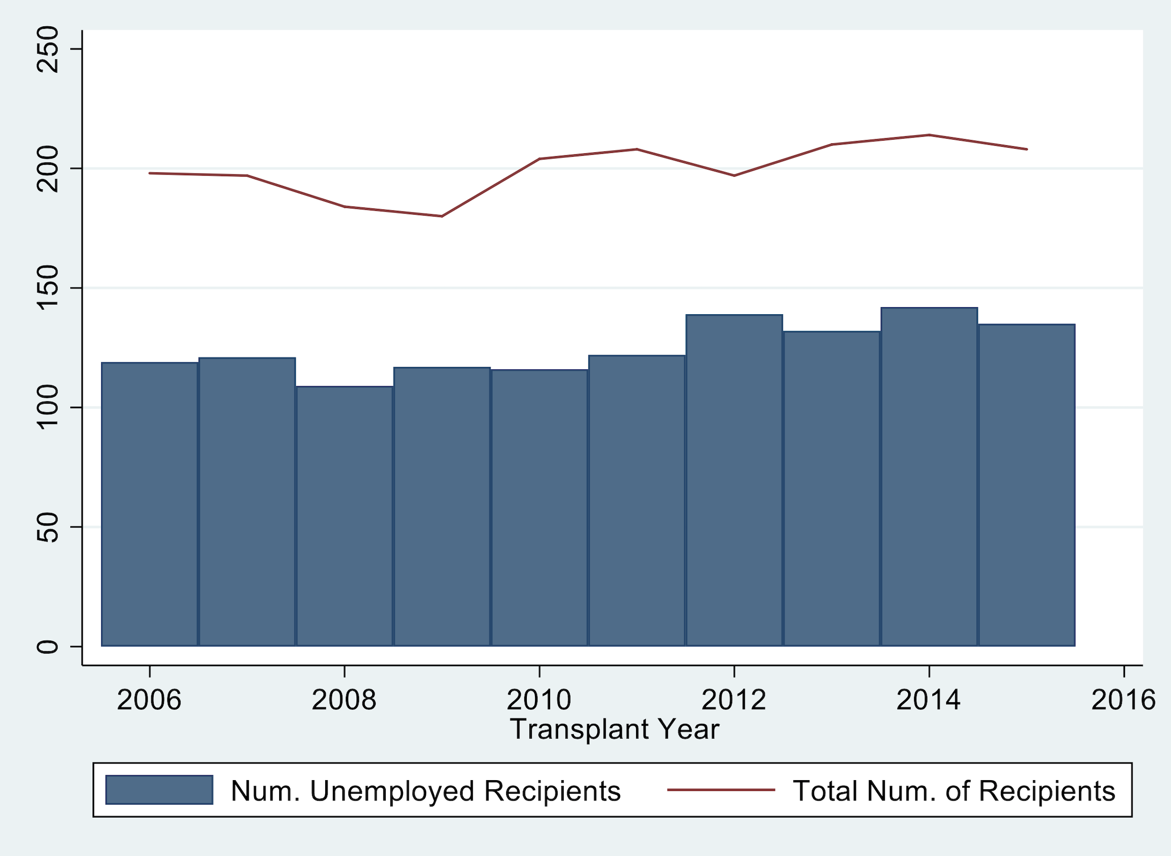
Fix your graph from question 2 so that the y-axis begins at 0 and labels go from 0 to to 250 by increments of 50.
Part 2#
Edit your code for questions 1-3 so that you export the three graphs as lastname_q1.png, lastname_q2.png, and lastname_q3.png.
Import transplants.dta. Create a graph that is two scatter plots overlaid. Graph recipient weight in kilograms (
rec_wgt_kg) on the y-axis and age at transplant (age) on the x-axis, with separate colors and/or makers for males and females. (HINT: if might be helpful). The legend should denote the two categories as “male recipients” and “female recipients”. Export the graph aslastname_q4.png.

Import tx_yr.dta (created by lecture5_2019.do). Graph unknown, hypertensive, and diabetes by yr. Include a title, y-axis title, a red-vertical line at year 2008, change the colors and patterns of each line, change the labels in the legend, make the legend span 3 columns, and fix the y-axis. The graph should look like this:
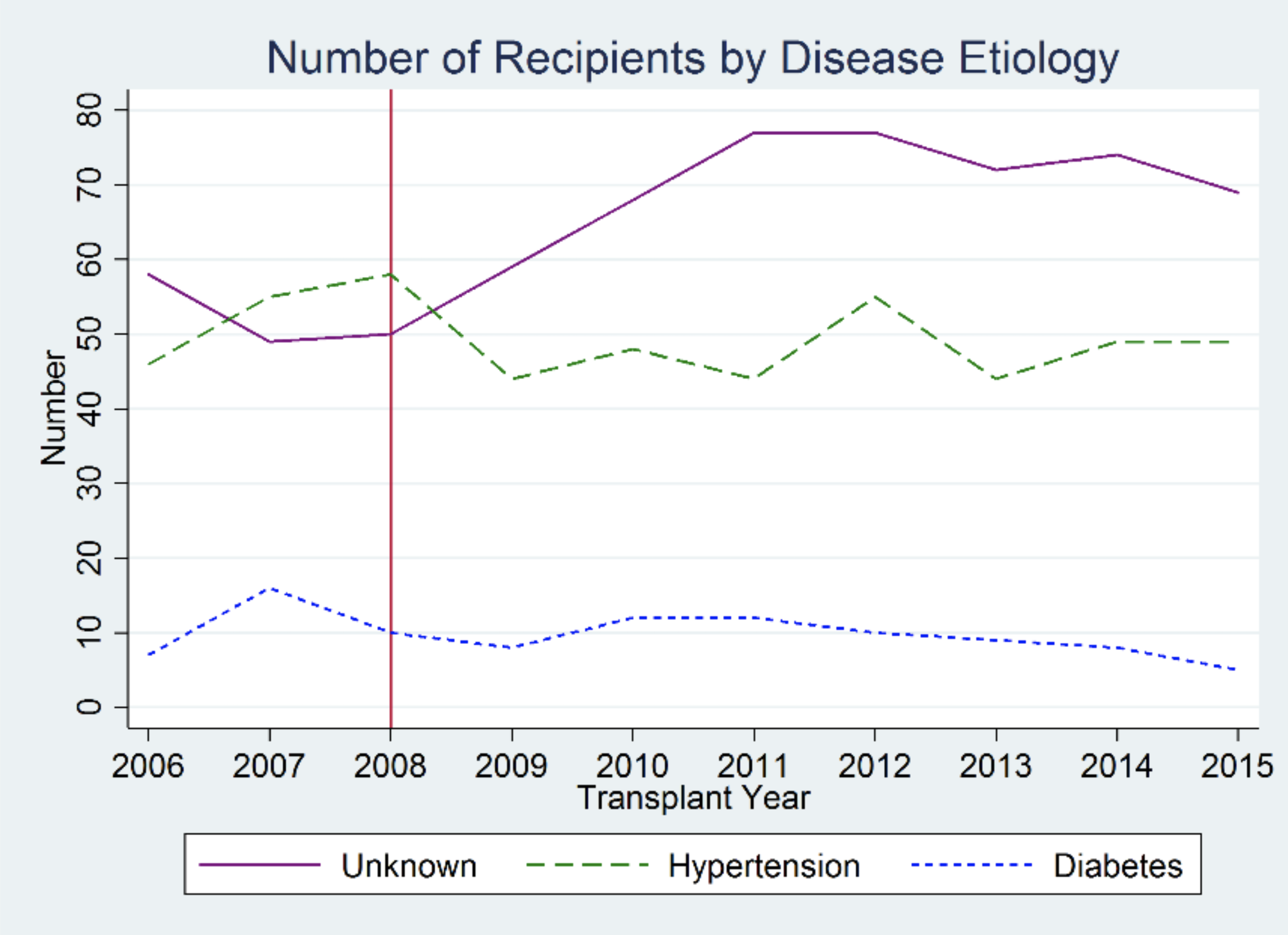
Export the graph as lastname_q5.png.
For an extra point: Add the text “Policy Change” to the figure near the red line.